Computer Cursive by Tay Papon Punyahotra
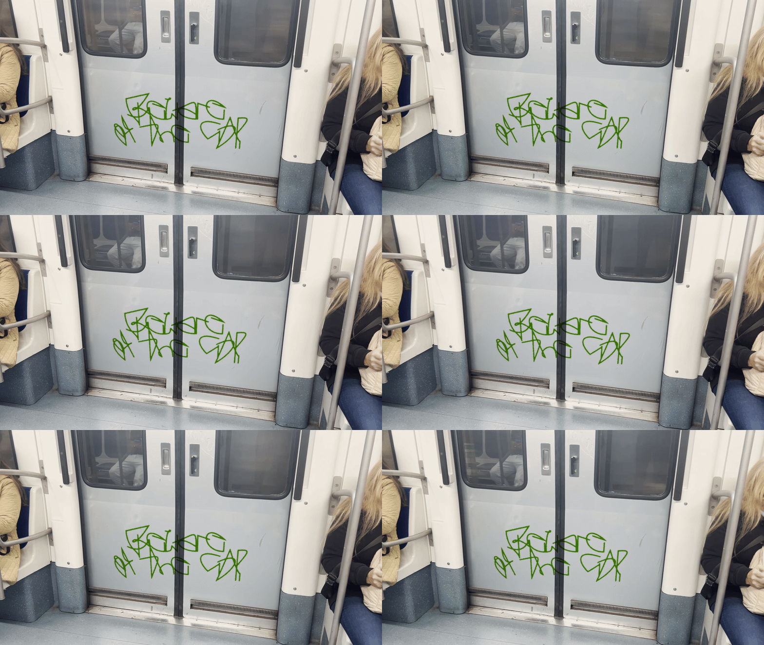
One of the first exercises I assign to my students in my seminars is called “Random Compositions”. Basically, it’s quite simple and could be formulated as a prompt like this: Develop a sketch using Processing or p5.js in which various shapes get randomly placed on the format. The results that my conceptually very strong students come up with are often absolutely remarkable. They often weave a story, a certain poetry into this seemingly abstract brief, bringing unusual ideas from their own individual context into play and turn it into something utterly unique. One project in particular hooked me in my seminar, simply because it was precisely this transfer of the task into a something poetic that took place so smoothly and elegantly. It was created by Papon Punyahotra and is called “Computer Cursive”. Let’s just let him speak for himself:
Can code be used to design a typeface? At a glance, the letters we use seem to be too specific to be made randomly. However, with enough iterations I was able to curate a complete alphabet, numbers, and a few ligatures and punctuations. Through this project I wanted to explore how letterforms could be “discovered” by using a fixed system. By studying and curating the forms I was able to reflect on the fundamentals of each character, legibility, and how each letter works together.


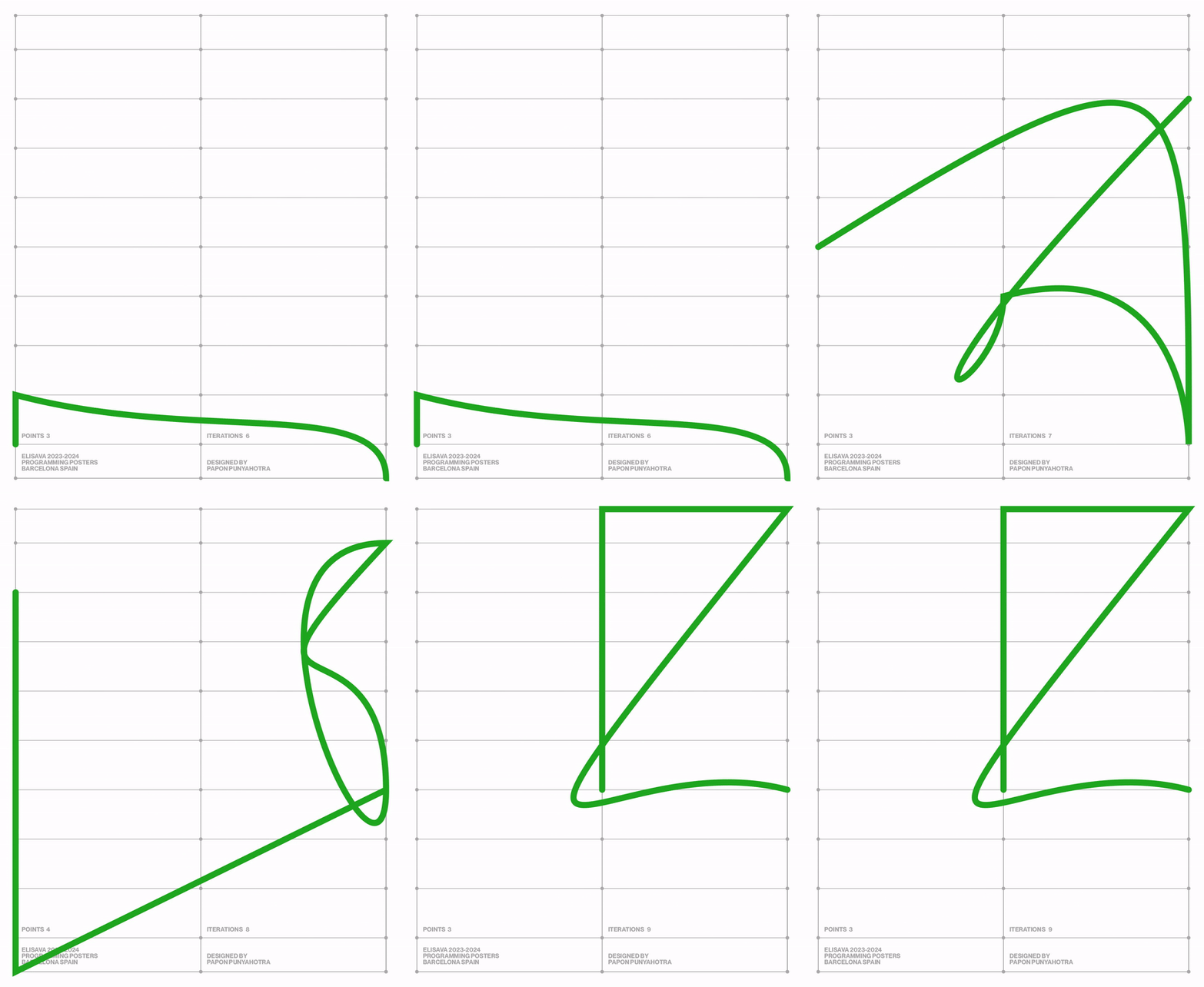


While setting the parameters for the system I focused on exploring three main guidelines, the proportions, the aesthetic of the form itself, and complexity of the shape. I wanted to ensure that the rules that I set would facilitate the best opportunity for letters to form. Therefore, I first decided on a simple grid, using proportions you would use for a regular typeface. Secondly, I experimented with fills and strokes. In the experimentation the strokes worked best since they provided a more breathable form compared to the filled shapes. Finally, I experimented with the complexity of each shape via the number of points plotted. I found that 3 – 7 points worked best as it allowed for both simple and complex forms to be generated.

The final system is comprised of a 3 by 11 grid and the fixed number of points. The points plotted on the grid was connected with a straight line or a bezier curve at random. This allowed for curved forms as well as straight geometric lines. By using this system I generated 1,000 forms each for 3, 4, 5, 6, and 7 points, making a total of 5,000 forms.
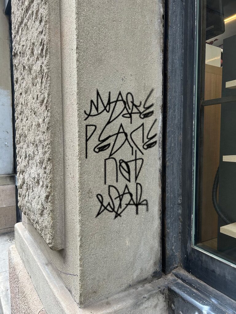
The final typeface is comprised of curated shapes that were all generated using Processing, these curated forms were then added to glyphs and exported as a usable typeface. The final forms were surprisingly similar to the letters we use, although some forms were more recognizable than others. Even more surprisingly, the forms generated felt like they had been handwritten, hence the name Computer Cursive.

Related
Related
 Sam Griffith connects Creative Coding with Enviromentalism
In this post I’d like to introduce you to Sam Griffith, a talented graphic designer based in Detroit, to discuss […]
 Throwback: My Talk at Demo Festival 2022
The next edition of the DEMO Festival is already approaching and I am currently developing a brand new talk for […]
 Powers of Two – 128kb by Lena Weber
20 = 1 21 = 222 = 323 = 824 = 1625 = 3226 = 6427 = 128 … »In […]
 p5.js Design Tools Directory
Hi! In this post I’ll collect case studies and direct links to tools that people have built with p5.js and […]
 Omid Nemalhabib explores the intersection of Creative Coding and Perso-Arabic Typography
In 2022, I spontaneously posted a story on Instagram: If anyone out there is also in Rotterdam, I’d love to […]
 Lena Weber about her collaboration with A. G. Cook
Lena: This 10-minute visualiser for A. G. Cooks album teaser featuring my python archive generator, is one of my favourite […]
 Ruder Processing Unit by Kevin Koch
In my teaching at universities and in workshops, I have met many very enthusiastic and highly talented people who have […]
 A custom Mockup Tool, built with Processing (updated)
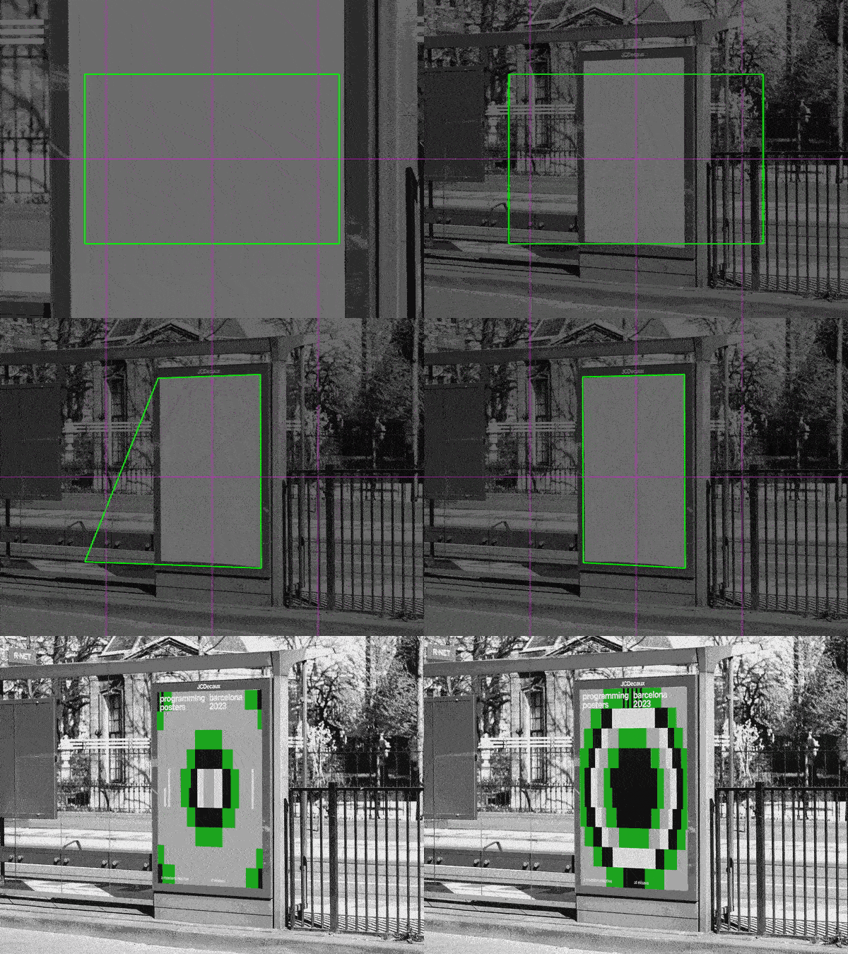
For my students at Elisava, I have created a new version of my mockup-tool. You need two different files for […]