Omid Nemalhabib explores the intersection of Creative Coding and Perso-Arabic Typography
In 2022, I spontaneously posted a story on Instagram: If anyone out there is also in Rotterdam, I’d love to meet him/her! Omid Nemalhabib, a highly sympathic and sharp-minded graphic designer from Tehran, responded. We spent the whole afternoon in thought-provoking conversation. Omid is fascinating as a person and as a designer. His work oscillates between continents and cultures, between Swiss typography and expressive oriental ornamentation.
After our great encounter, I sent him access to my website and my online courses, just to ask him for an opinion about it. Soon the first posts appeared on his Instagram channel: He was using Arabic letters for playful, vibrant ASCII visualizations. I had never seen anything like it. In April 2024, I sent him a few questions to find out how he liked his journey into the world of programming. These are his answers.
creative coding opens up new possibilities for me to think and act in different ways.

Tell us about your background! How did you become a designer?
My interest in design was sparked unconsciously based on the environment I was experiencing, and it significantly impacted my childhood. I used to spend many days in my father’s design and printing office in Tehran, where printed works, books, calligraphy, letter stencils, and paper scraps surrounded me. Even though I couldn’t understand the meaning of words and letters, I was fascinated by their form and details. One of my favorite activities was playing with Persian and Latin Letraset sheets, which had a significant influence on shaping my initial ideas and motivation for choosing this field. I loved watching graphic designers work behind large desks and create completely analog collages for the final print version. Witnessing the printing process of old Heidelberg letterpress machines was incredibly entertaining for me. This slow-going task from design to printing and publishing, as well as witnessing the transition from manual processes to computer-based ones, ignited more excitement, curiosity, and eagerness in me. After studying human sciences in high school, I was drawn to literature, poetry, philosophy, and history, which indirectly boosted my enthusiasm for visual arts and design. Over the years, I learned and practiced independently with a lot of curiosity in Persian calligraphy and a self-immethodical and spontaneous approach to typography and experimenting with interactive and motion graphics which placed me more in the realm of visual arts and design. Eventually, I made a conscious choice to focus on graphic design and pursue an academic education in this sector since I felt more certain that it would help me think and work more multidisciplinary. As a designer, this was simply the beginning for me.
What made you fall in love with typography especially?
Although my intense fascination with letterforms could be seen as the primary reason for my interest in typography, it is not simply a matter of expertise, skill, and technique. Over time, I have come to recognize its profound presence, role, and connection to historical, political, and social contexts. Its potential for recording and documenting these processes has become increasingly attractive to me. My interest in creating typographic works was initially formed through intuition and experimentation, but my understanding and approach have been evolving and still changing significantly. I am interested in exploring and experimenting with typography’s role in cultural, social, and political contexts, and its relationship with history, technology, power, movements, and visual culture. Furthermore, I am intrigued by the way typography interacts with our daily lives and emotions. These are the concerns that fuel my passion for learning and experimenting in this field.
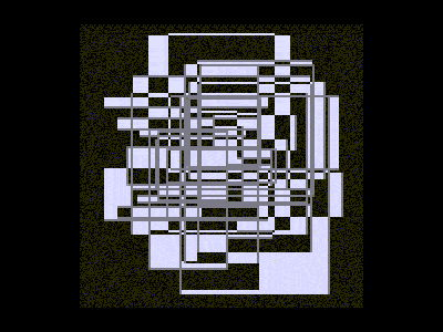
Your ASCII Illustrations using Arabic letterforms are super interesting, can you tell us about the process behind them?
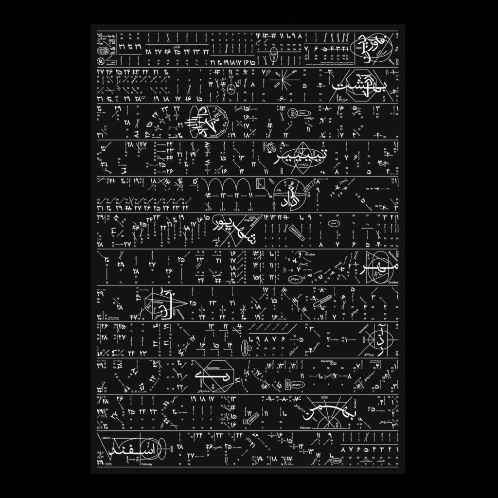
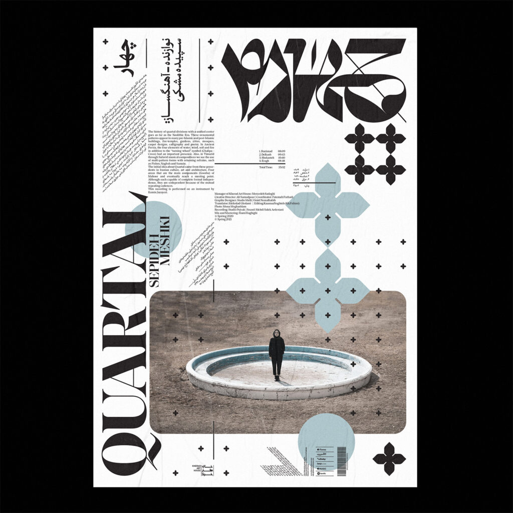
One of my primary motivations for creating this collection of ASCII art was to experiment with limitations. I wanted to focus on using one typeface, one color, and one simple structure to create as much variety as possible from these constraints. I also wanted to make the process a completely experiential learning experience for myself. Another challenge I faced was the lack of connection between the technology and the structure of ASCII with the Persian-Arabic script. However, this challenge provided me with an opportunity to interact with technology and find new ways to create. Based on the features of connected letters on the baseline and the roots of Persian and Arabic as a cursive script, it is typically difficult or even impossible to create ASCII art with this language’s core essence. Despite this challenge, I tried to redesign and create new forms, and typefaces, and modify my tools with this theme. I even manipulated some of my self-made fonts to document the results of my experiments. My redefinition and reconstruction of an ASCII work is a way of using creative coding, type design, and motion graphics to put my narrative and message at the heart of these typographic works. Lastly, I aimed to use the concept of “Siyah Mashq” or “The Black Practice,” a calligraphic style/exercise that has a huge history in my cultural background that I find mesmerizing. I want to give it a fresh perspective and create a contemporary aesthetic for it as a revival project.
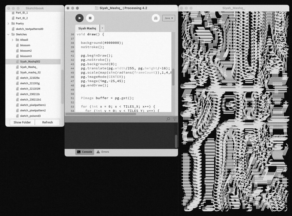
Can you tell us more about “Siyah Mashq”?
Basically, the calligraphy practice sheets known as “Siyah Mashq”, or “black practice”, are frequently fully covered with writing. They might consist of a number of words and letters arranged diagonally on the folio in groups facing both upwards and downwards. On the one hand, “Siyah Mashq” was a warm-up exercise for the calligrapher to improve the shape of the letters by repeating them over and over. These procedures produced a page that was filled with text and letters. Calligraphers developed their own style as a result of seeing how beautiful some of these works were. For the sake of composition and style, words and letters are repeated regardless of their intended meaning. On the other hand, this exercise was a critical reflection to a certain personal, social, or political situation that held a hidden or encrypted text, huge concept and concern behind the powerful shapes of letters to convey a message through the poetry, personal written manifesto or quotes.
For me, this is a kind of tribute and scrutinization of one of my cultural background inspirations not in a traditional or conventional way but in an experimental process, and questioning how the intersection of technology and design could remove, develop or revive an aesthetic or a style from past centuries. At the same time, it is crucial to know that sticking to history and repeating its visual aspects is joyful and pleasant but is never enough. So, thanks to your courses and great community of trcc and getting to know more about the possibilities working with processing from last year I found an incredible connection between the coding tools and my favorite inspirations in typography “Siyah Mashq” to revive and create a new and contemporary approach to these crazy and tempting Persian things combined with codes and computers.
In the meanwhile, based on my process and the way of working between analog and digital platforms I statred working on a publication connecting all these ideas as a method of documentation and it became a big grounding research and experimentation for me to continue combining the idea of Siyah Mashq and creative coding and it is called: “Siyah Mashq, Epistemology on Activist Typography” which is an essay on politics, reproduction, and the ethical landscape of typographic design. It is an ongoing project and the limited edition publication will soon be available with the support and in collaboration with some independent publishers.
What is it like as a custom-type expert diving into creative coding? What experience and perspective did you have while learning to code?
As someone who is currently learning creative coding, I am still searching for this answer. However, as an enthusiastic designer in the field of typography, I find that creative coding takes me out of my comfort zone, allowing me to experience new and alternative scenarios. It opens up new possibilities for me to think and act in different ways. Although I often struggle with coding and mathematical calculations, I strongly believe that these tools are very powerful and can be game-changers. Learning creative coding has been one of the most challenging courses I have taken, as writing, copying-pasting codes, and getting results out of it is a path full of errors and failures. Nonetheless, I have learned to enjoy this process of dynamic and creative iterations and it has had a profound impact on my attitude in other areas of design. Reflecting on my work and reviewing everyday tools and technologies in a professional context has become a natural part of my thinking process. Gaining awareness and knowledge about creative coding has also given me a better understanding of the mechanism and operation of various systems. This topic interacts with my favorite parts and areas in type design and typography on a two-way road.
creative coding takes me out of my comfort zone, allowing me to experience new and alternative scenarios.

Do you see an intersection of a calligraphed aesthetic and a programmed one?
It may not be immediately obvious, but upon closer examination, I believe that these two seemingly different entities share a common boundary, which is an adaptable system that can modify and update itself in response to changing conditions. In my opinion, calligraphy is a collection of gestures, movements, behaviors, and geometric forms that can create a particular aesthetic and can be repeated through visual concepts or skills. Deciphering and analyzing these aesthetics is closely tied to the cultural and philosophical backgrounds that have contributed to their formation.
As someone fairly inexperienced with the Arabic alphabet what are some challenges and joys of working within the system?
When examining typography in the context of Middle Eastern culture, particularly Iranian, we encounter a multitude of historical references including ethnic diversity, cultural and linguistic roots, visual culture, writing systems, and a variety of scripts. Perso-Arabic script is inherently diverse and has great potential due to its structure and calligraphic features. However, it also poses challenges due to its manipulation of old calligraphy rules and lack of compatibility with imported Western technology, making it a complicated field to interact with modern graphic design. While I draw inspiration from studying and practicing these historical roots and their aesthetics, I am more interested in making changes and breaking rigid rules. It is difficult and limiting to present modern methods while preserving the spirit and cultural identity of the past. I enjoy the simultaneous use of languages and cultural characteristics, which creates a creative and dynamic process for me. Therefore, in recent years, I have been practicing Latin typography from scratch, alongside my work in the field of Perso-Arabic typography. Understanding writing systems and their application and aesthetics in different languages, and integrating them with generative and flexible systems using technology-driven tools, has been a kind of reaction in the opposite direction of routine methods that I personally enjoy.
While I draw inspiration from studying and practicing these historical roots and their aesthetics, I am more interested in making changes and breaking rigid rules.

What inspires you?
Over time, I realized that the strongest source of inspiration for me is music; Then sounds, waves, visual and concrete poetry, ASCII and ANSI, calligrams, philosophy, reading about socio-political and art movements, and counterculture. I also enjoy a lot of “Derive” or “Drifting” wandering through the city as well as long walks in silence give me a lot of inspiration.
Do you have a design philosophy?
I’m not sure if I can call it a design philosophy, or if it’s simply my current statement on design that may evolve with time based on my experiences. However, the core foundation of my current design approach is to concentrate on creating a critical, ethical, healthy, and sustainable perspective, while also exploring alternative solutions. I believe that as a designer, I prefer to mark and create situations rather than only solve problems! So, in this context, creating a situation doesn’t emphasize one-dimensional and result-oriented graphic design, but also the act of recognizing, redefining, and challenging common or antiquated assumptions about form and function. This critical look at design has the potential to craft new solutions and rules. Rules for our time, for here and now, so that can establish a distinct tone and aesthetics that are not simply a response to the tastes of a large audience, but rather attempt to promote new thinking, motivation, and mindsets.
Your designs seem to be inspired by both the digital and the analog, where do these practices fall in your workflow?
This is one of my most essential and strong motivations to build an experiential and shared space between analog and digital design. As I mentioned earlier, this approach is partially rooted in my past and it is influenced by the flow that emphasizes tangible and physical materials, manual labor, crafting, making, and spending time with the conventional meaning, but there are other aspects in play. Regardless of the typical definitions of material, if we acknowledge that code, data, information, and digital visual elements can all be considered as “material”, we are breaking down barriers between spaces, tools, technologies, disciplines, and thinking and design approaches. This back-and-forth area is like my playground, allowing me to express my narratives from many perspectives and using a range of tools. What we see in the end will probably be an amalgam of my understanding and experience with both of these sides. One of my recent experiences designing without the use of mainstream tools such as Adobe software, and instead coding and printing them directly through old printers and code-compatible plotters, is the closest and most tangible example I have right now. This experience has influenced the design process for my other projects as well.
Links
- Omid Nemalhabib Website Instagram
- Studio Melli Website Instagram
- It’s Nice That Article
As always, many thanks to @lenaweber404 for the editorial design and execution!
Related
 Sam Griffith connects Creative Coding with Enviromentalism
In this post I’d like to introduce you to Sam Griffith, a talented graphic designer based in Detroit, to discuss […]
 Throwback: My Talk at Demo Festival 2022
The next edition of the DEMO Festival is already approaching and I am currently developing a brand new talk for […]
 Powers of Two – 128kb by Lena Weber
20 = 1 21 = 222 = 323 = 824 = 1625 = 3226 = 6427 = 128 … »In […]
 A conversation with Talia Cotton
During OFFF Festival here in Barcelona, many interesting people come around! This interview with Talia Cotton came about almost by […]
 Lena Weber about her collaboration with A. G. Cook
Lena: This 10-minute visualiser for A. G. Cooks album teaser featuring my python archive generator, is one of my favourite […]
 A conversation with Anna Shams Ili
Hi Anna! It was super nice to meet you at the PCD CPH, I really liked your talk in which […]
 A conversation with Lisa Apers
Hi Lisa, it was amazing to meet you at Processing Community Day in Copenhagen! For those who don’t know you: […]
 Computer Cursive by Tay Papon Punyahotra
One of the first exercises I assign to my students in my seminars is called “Random Compositions”. Basically, it’s quite […]