Llum Negra / La Luz Negra / Black Light
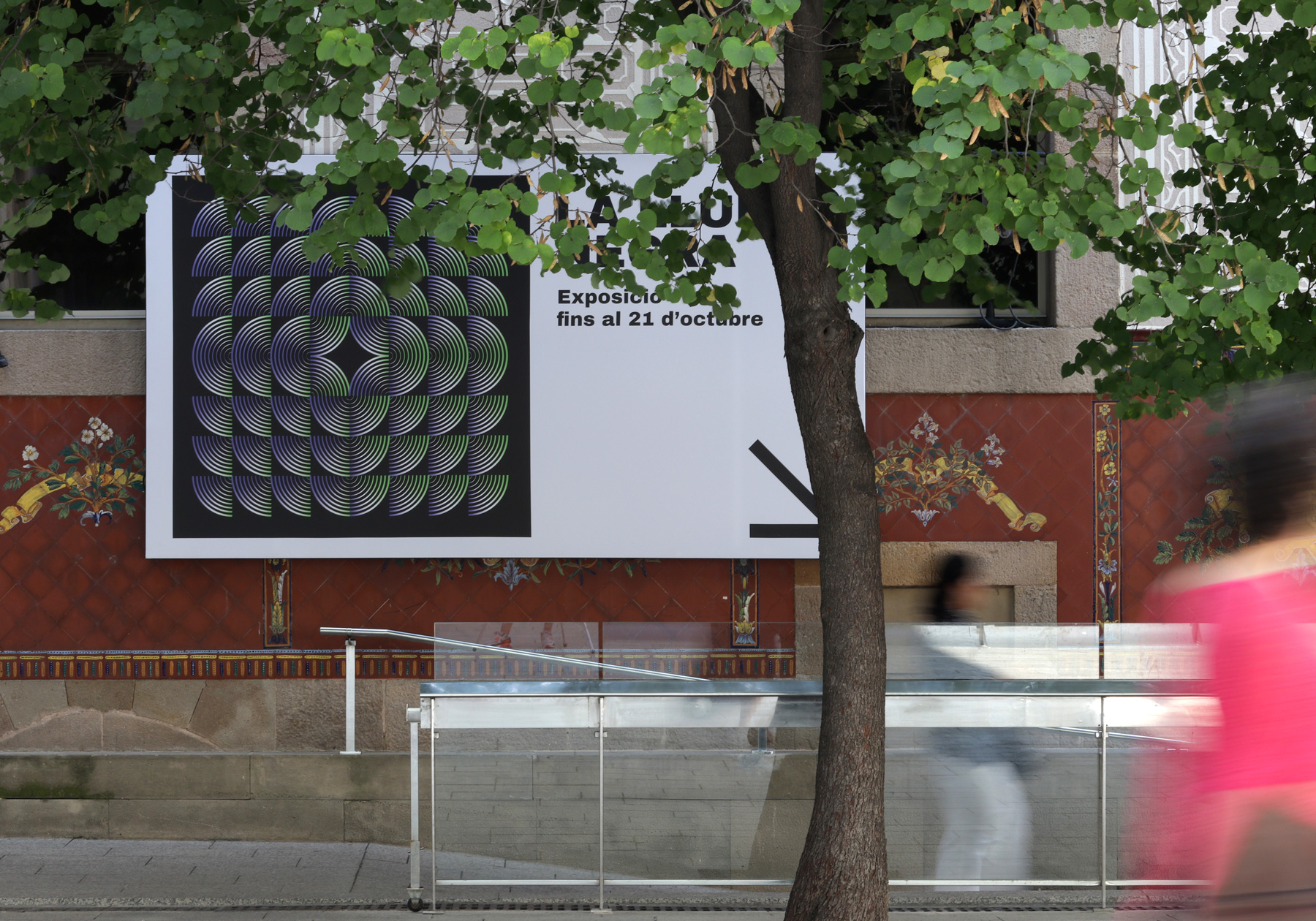
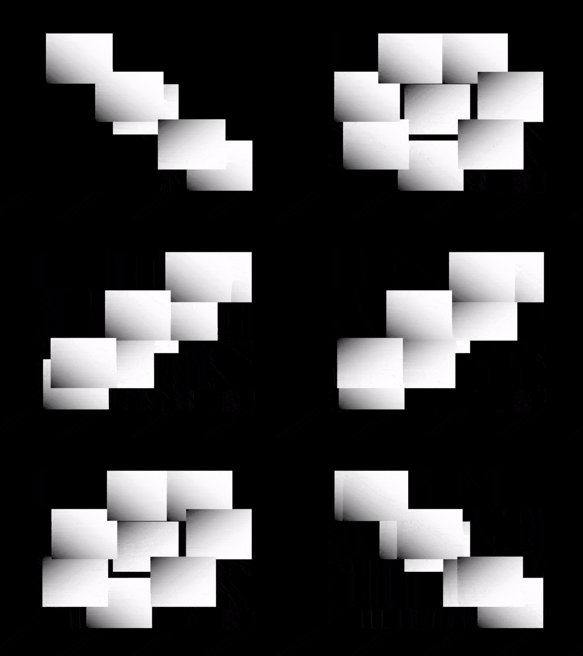
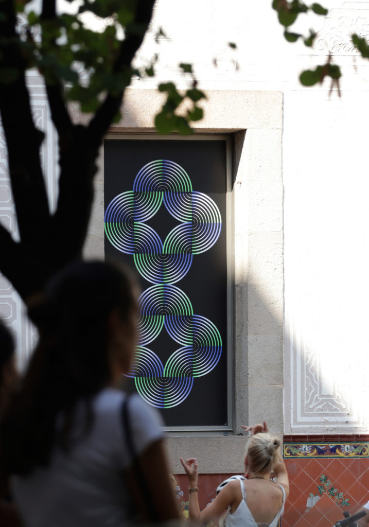
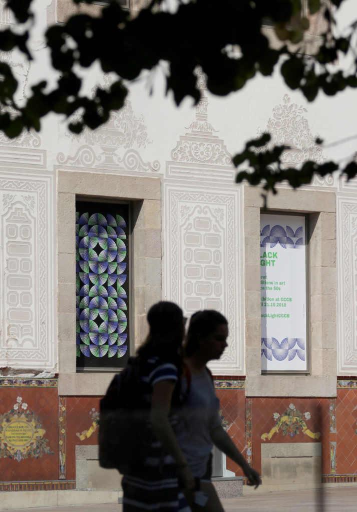
In 2018 I collaborated for the first time with the design studio TwoPoints.Net, based in Barcelona and Hamburg. I had known the work of Martin Lorenz and Lupi Asensio’s office for many years. Martin worked in the early days of his career at the design studio HORT, of which I was a huge fan before 2008. When the request for a collaboration with TwoPoints.Net came to me, I was very excited. It was about a project for the CCCB, the Centre de Cultura Contemporània de Barcelona. A flexible visual identity was to be developed for the upcoming exhibition “Llum Negra”, which focused on occultism in art. TwoPoints.Net had developed a dynamic grid system of geometric components in advance. The components consisted of rows of quarter circles and could be combined in a variety of ways to create a wide range of patterns, symbols and typography.
My task was to explore what possibilities the system opened up with Creative Coding. I immediately had a thought: what if we made it publicly available through a website so that people from all over the world could create their own graphics with it? Theoretically, you could develop various campaigns with user-generated content that could be used to promote the exhibition on the Internet.
Basically, Processing is almost always the tool I start my projects with because it’s great for developing quick designs and iterative sketches. I immediately got to work and developed a first prototype.
After the initial proof of concept, I took it a step further and turned it into simple software that I could use to create animated patterns and typography. Basically, it worked like traditional stop-motion, frame by frame. The videos were used for marketing the exhibition on the web and on outdoor displays right on site.
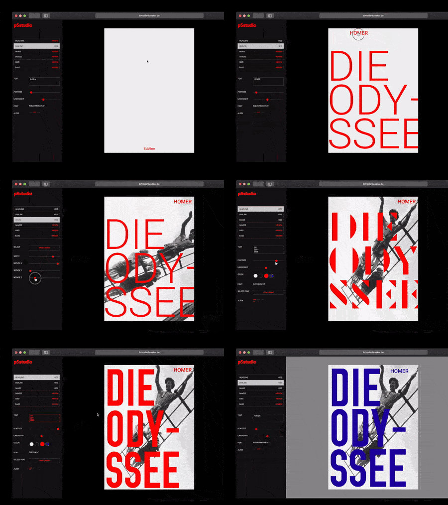
The final step of the project was to create a web application that would allow users to create their own graphics directly in the web browser. Even though the software worked very well, it failed in the end because of the missing sharing functions, so that sharing on social media became much more complex than originally thought.
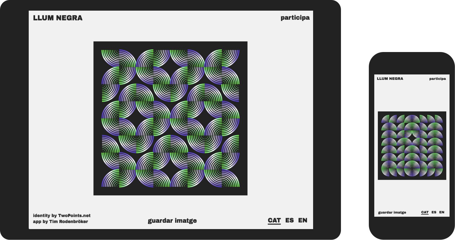
The project is a good example of the symbiosis of graphic design and creative coding. Since TwoPoints.Net had directly created the identity for the exhibition in a flexible and dynamic way, the translation of the system into code was relatively easy.
“La Luz Negra” showcased works by Antoni Tàpies, Agnes Martin, Henri Michaux, Joseph Beuys, Ulla von Brandenburg, William S. Burroughs, Joan Jonas, Jordan Belson, Goshka Macuga, Kenneth Anger, Rudolf Steiner, Alejandro Jodorowsky and Francesco Clemente i Zush.
Related
Related
 The Story of 128KB
One day in January 2024, I was lethargically scrolling through my Instagram feed on my laptop. And, as so often […]
 DEMO 2025 – My Submissions
Limitations have always been playing a major role in my creative work; I was only able to develop my best […]
 The 128kb Framework and its Aesthetic Characteristics
One day in early 2024 I started to experiment with a new idea. I wrote down a set of rules […]
 My new writing project “downgrade” is live
Hey folks, I hope you are doing great! You may have already read one or two of my essays that […]
 Join the 128kb challenge!
Instagram, Twitter, TikTok… All the main platforms that technically have the required features to connect emerging communies for Creative Coding […]
 A custom Mockup Tool, built with Processing (updated)
For my students at Elisava, I have created a new version of my mockup-tool. You need two different files for […]
 New work for the New York Times
Once again, I had the honor of illustrating an article for the New York Times that I myself am very […]
