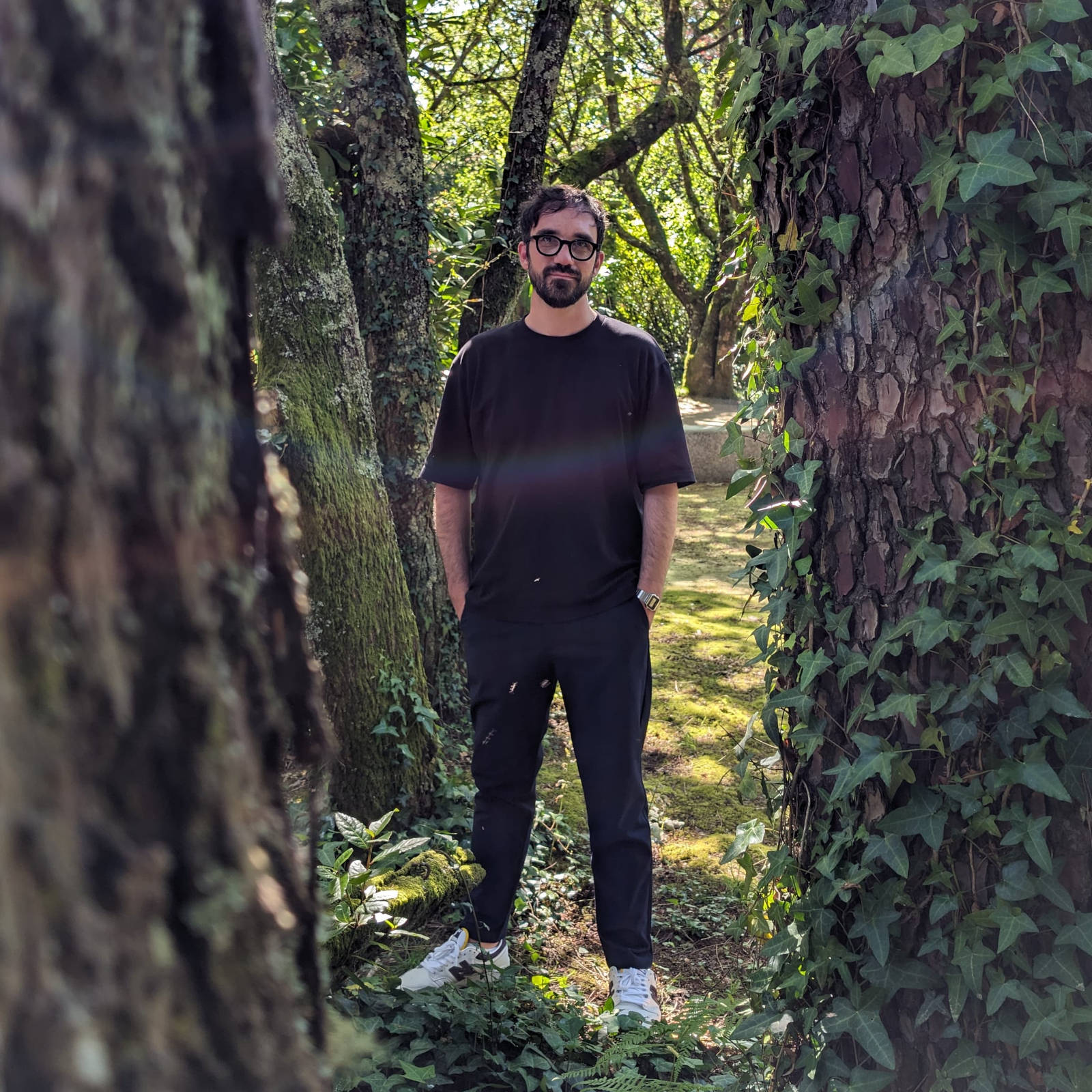
Ruder Processing Unit by Kevin Koch
In my teaching at universities and in workshops, I have met many very enthusiastic and highly talented people who have delivered highly impressive projects. Many of them have surpassed me in different areas. Among these special students, Kevin Koch has a unique role. He expanded on my seminar topic of “Programming Posters” in his bachelor’s thesis and presented a project called “Ruder Processing Unit”, which I consider unsurpassable in the context of a bachelor’s thesis. I have been in contact with Kevin has created a project documentation especially for this blog, which I would like to share with you here. Let’s dive into it!
In April 2019, I had the opportunity to attend a course by Tim Rodenbröker. At that time I didn’t have much to do with programming and I hadn’t even heard of terms like Creative Coding or Processing before. Professor Lars Harmsen (Professor at the Fachhochschule Dortmund for Communication Design, Slanted) sent a circular email to all students who enrolled in his poster course to attend Tim’s Programming Posters Course because it could be a good addition to his own course. And like probably many people before, I thought: “Programming? Do I really want to do this to myself?” But despite all my reservations about programming, I went to Tim’s course. In the end, it was one of the best courses I ever took in my studies. It turned my attitude to design upside down and fundamentally changed my perspective on possibilities and limits in design. By the end of the course, it was also pretty clear to me that I would like to realise my thesis with Processing. The idea of building an application as a bachelor’s thesis already came up in Tim’s course. Tim had introduced us to his project P5 Studio, a web application for creating posters that can be found here P5studio. He did this, among other things, to show us how far technology threatens us as designers. This had already had a lasting influence on me at that time, and when I became familiar with Patrik Hübner’s work and his philosophy of empowering designers to build their own design tools a little later, it was also a guideline I could identify with. For me, this was the start of fundamentally questioning my attitude towards design and considering Creative Coding as a possible answer to help shape my own design future.
Building an application is a complex task and I didn’t realise how complex it was at the end of 2019. I had naively believed that I would somehow manage to work on a Bachelor’s thesis and learn processing at the same time. But only after a few attempts, failures, learning curves and prototypes of my own design applications did I have the experience and knowledge to really develop such a complex project with Processing in 2022.
In the summer of 2021, I came across the book Typographie by Emil Ruder, which inspired me to use this as the basis for my thesis. The Ruder_Processing_Unit is an application that interactively deals with the works and design methods of Emil Ruder’s book. It is an attempt to explore the “interaction” of graphics.
Unlike the approach of other applications, it was not the intention to build a design tool that has any buttons and sliders, because such applications exist and have existed before. Instead, the idea was to question how to design individual graphic applications in a way that they change through the interaction of the viewer/user. For me it was very interesting to explore if you could design graphics interactively in a way that they could be displayed on something like a billboard at a bus stop or at a train station, so that people could interact with a poster like with a website.
From this thought, it was also quite clear to me that the interactions should be controlled by the mouse. The mouse is based on the same concept as touch control with fingers and is basically the virtual hand with which someone can make precise inputs. Another reason is that the project should be kept quite simple. Other input devices can be considered later. Because in essence, the first thing is to see which types of interaction work well and how I can adapt Emil Ruder’s design principles to have an interactive communication system. And for this, the use of pure mouse interaction was simply the most suitable.
Emil Ruder or his book Typographie was chosen as a research object because his works have many characteristics that fit very well into a programmed design for me. On the one hand, because a lot of work was done with grids and on the other hand because transformations such as scaling, the use of distances and dimension, was a closed grid system. The simplicity and the absence of effects that come with programmes reminded me a lot of designing with Processing. It was more like constructing and thinking through a design with only basic shapes, typography and a set of rules.
At the beginning of the development, the big question was of course, how do you start? How do you structure something like that? What expectations and ideas do I have?
This led to the following questions:
- What should the application be able to do?
- What does the interface look like?
- How do I design the individual design applications?
- What rules exist and need to be defined in advance?
- Which programming and design options are available to me?
Which I have divided into four main areas:
- Design of the graphics
- Design of the application
- Programming logic of the individual graphics
- Programming logic of the application
The strategy was to develop the individual graphics and the interface separately. In this way, I could concentrate mentally on individual aspects, be it ideas or individual development stages.
For the conceptions of the individual graphic applications, I also looked at the work of other Swiss graphic designers, such as Armin Hofmann, Karl Gerstner, Josef Müller-Brockmann Herbert W. Kapitzki, who worked also strongly with grids. However, my approach was most influenced by the German designer Herbert W. Kapitzki.
His explanations of positional changes and symmetry axes from his book Programiertes Gestalten and the case studies were very informative for developing the individual interaction transformations.

In programming, the question related to the various applications was which type of interaction is actually suitable. On the one hand, ideas for interaction came from thinking about what you can actually do with shapes. A cube can be rotated, it has six faces that can be played on, so you can quickly get the idea of using “rotation” as a transformation control
In total, with Grid Distance, Grid Cell, Type Spaces, Type Rhythm, Cubism and Wavism, there are six different interactive graphic experiments , each of has two or three variants, making a total of 16 different graphics that can be controlled by clicking the mouse, dragging elements or simply moving the mouse.


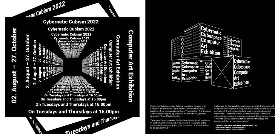


Admittedly, much of this is too experimental and probably not transferable for a real-world use, but as I said earlier, it is an interactive exploration of what interactive communication concepts might look like.
The user interface, although it looks like one, is not really a user interface. I see this interface more as a kind of presentation tool to show the individual experiments, their variants or the use to different formats. It’s more like a book where the different graphics experiments are like chapters and you go through them. The only difference is that you don’t read it, instead you interact with the graphics.
The export options of PNG, PDF and MP4 are also more intended for presentation purposes, such as showing the individual graphics on social media. However, you can of course also use this for animation, the hand would be the easing tool in a way, which makes the movements much more natural than a well thought-out keyframing in an animation application like After Effects.
I would like to come back to the point of own design tool. Besides the aspect of interactive research, this is of course a self-developed application for a self-defined goal and corresponding use cases. I think it becomes clear here that Creative Coding empowers a designer to find his own design narrative. This becomes especially clear when it comes to finding ideas, because it is a balancing act between what is possible and how to make it possible.
Building an app is a complex process that you have to break down into small parts. That’s why it’s important to find strategies to build a basic framework, think about how to minimise errors and split problems in smaller tasks to solve.
Related
Enjoying the content?
I put a lot of love and effort into developing content on Creative Coding. Since 2018, I have published 209 interviews, case studies, and tutorials, along with over 272 lessons in 17 online courses – and there's more to come! If you'd like to support my work and help keep this platform evolving, please consider supporting me on Patreon. Thank you very much!
Related
 Powers of Two – 128kb by Lena Weber
20 = 1 21 = 222 = 323 = 824 = 1625 = 3226 = 6427 = 128 … »In […]
 Lena Weber about her collaboration with A. G. Cook
Lena: This 10-minute visualiser for A. G. Cooks album teaser featuring my python archive generator, is one of my favourite […]
 Computer Cursive by Tay Papon Punyahotra
One of the first exercises I assign to my students in my seminars is called “Random Compositions”. Basically, it’s quite […]
 Ksawery Kirklewski on his Symphony in Acid
For me, it’s by far the most inspiring project of the last few years: “Symphony in Acid”, a collaboration between […]
 Monica Losada on Overcoming Interfaces
She is super young, incredibly sympathic and insanely creative. In her work as a graphic designer, she experimentally explores the […]
 Lena Weber on Ambiguous Aesthetics
In this post I’d like to introduce you to Lena Weber, who has helped me tremendously with the translation of […]
 Key visual for Slate + Ash’s new software instrument
Together with Lena Weber I created the promo video for Slate + Ash’s brand new software synth called Choreographs. The […]
 “The Infinite Layout Machine” by Michael Kreß
This is the case study of a project by Michael Kreß, a student from one of my courses in the […]
